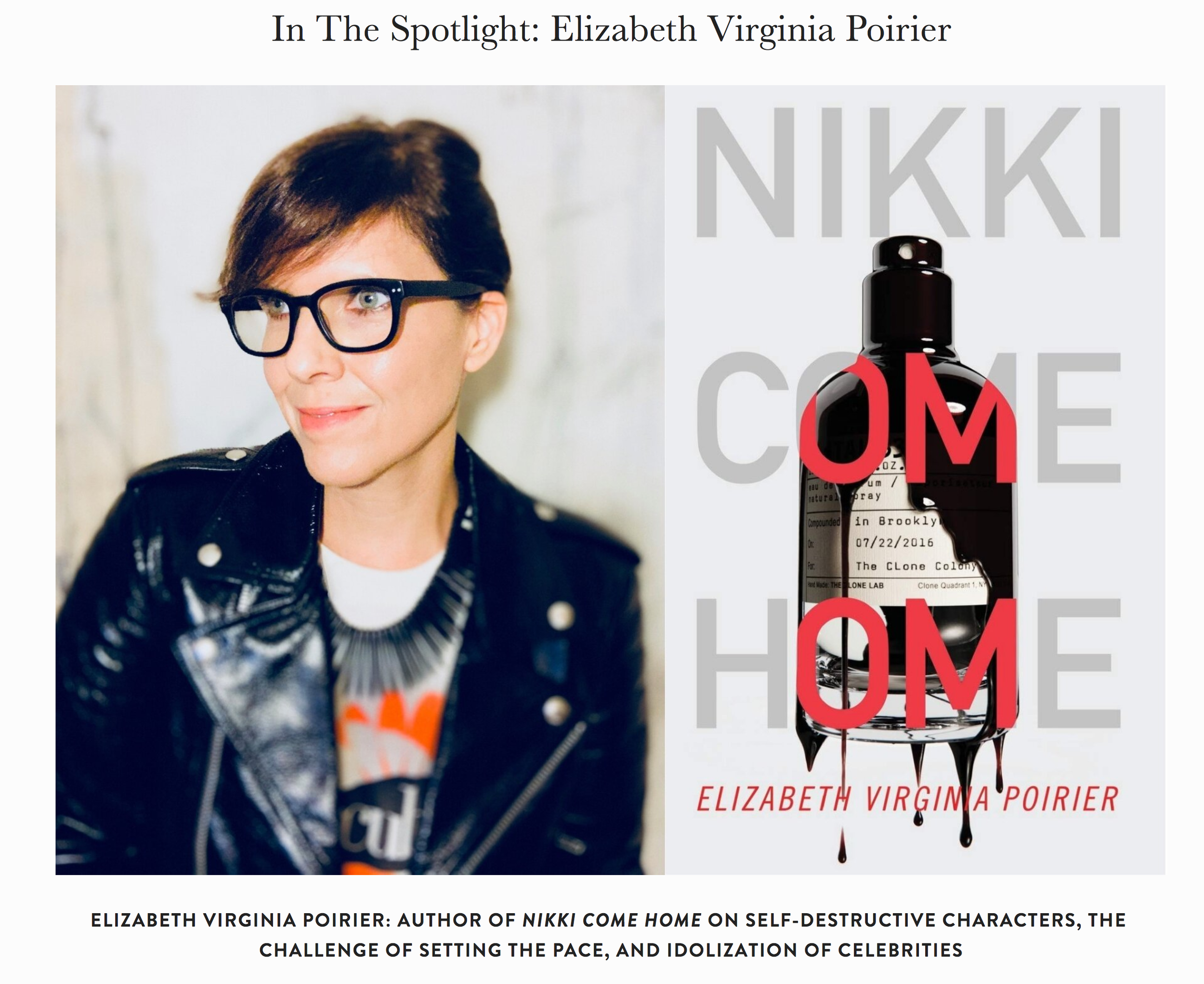
Nikki Come Home
this is what happens when you limit your life options to theater arts, standup comedy and bartending…
Over the course of two years you write a 295 page book entitled Nikki Come Home, assemble a solid collaborative team that includes an illustrator with three Megadeth album covers under his belt and a garage-rocking creative director from the wall street journal, then you edit the book (many, many, many times), edit it some more because you realize Michelle Obama’s spelled with two L’s, and finally publish the pretty little thing in paperback form at the beginning of a global pandemic.
Here’s how it all went down…
The Writing


Two years in the making, Nikki Come Home is a bit “ripped from the headlines”, a bit ripped from the lives of others. It’s a lively mash-up of addiction fiction, mystery and contemporary social critique.
The Book Design


Nikki Come Home is written in the vein of an epistolary novel. It’s divided up into weekly journal entries. Littered throughout the book are song playlists, as well as email and text correspondence. Designed by Aqualamb Records Johnathan Swafford, the novel’s pages are eye candy for font-heads who get off on the commingling of Courier and Tribute Roman on a page. Johnathan’s goal was to differentiate the various correspondence and lists into a repetitive visual language that really pop on the page.
The Cover


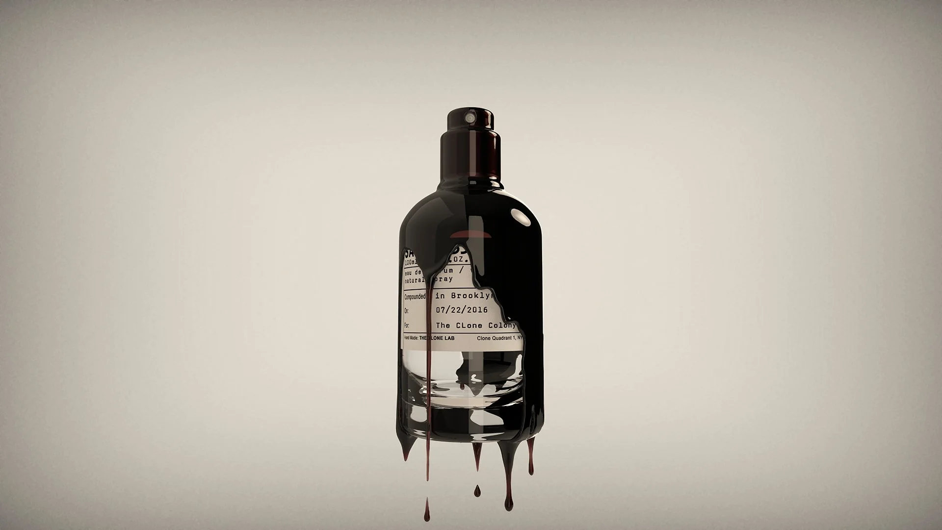
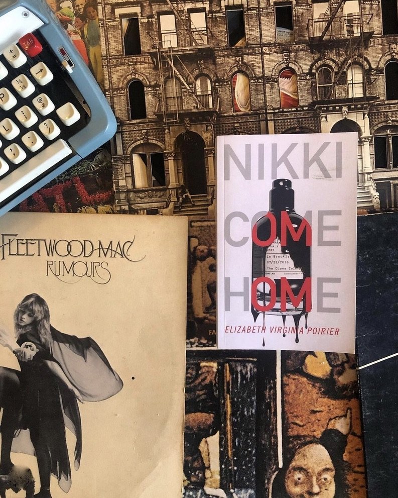
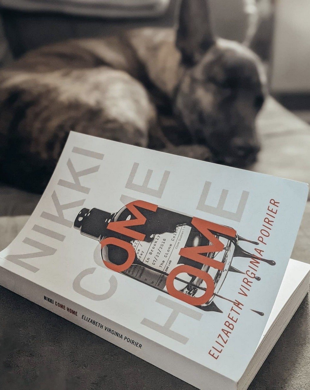
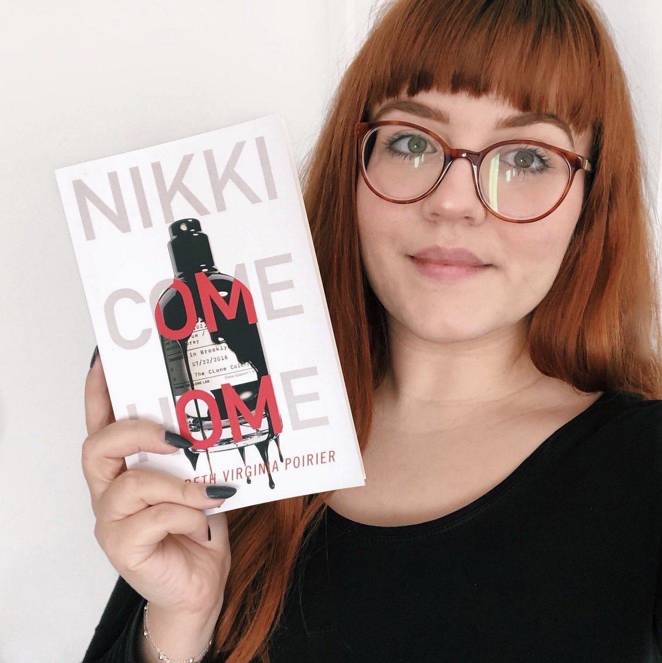
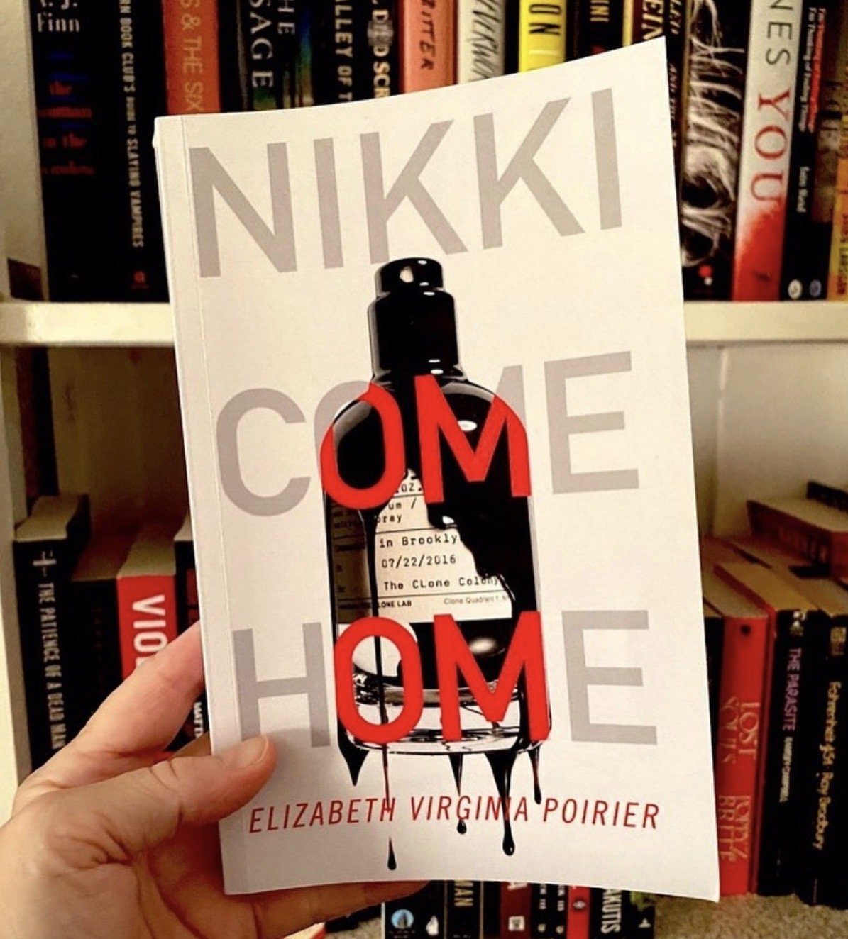
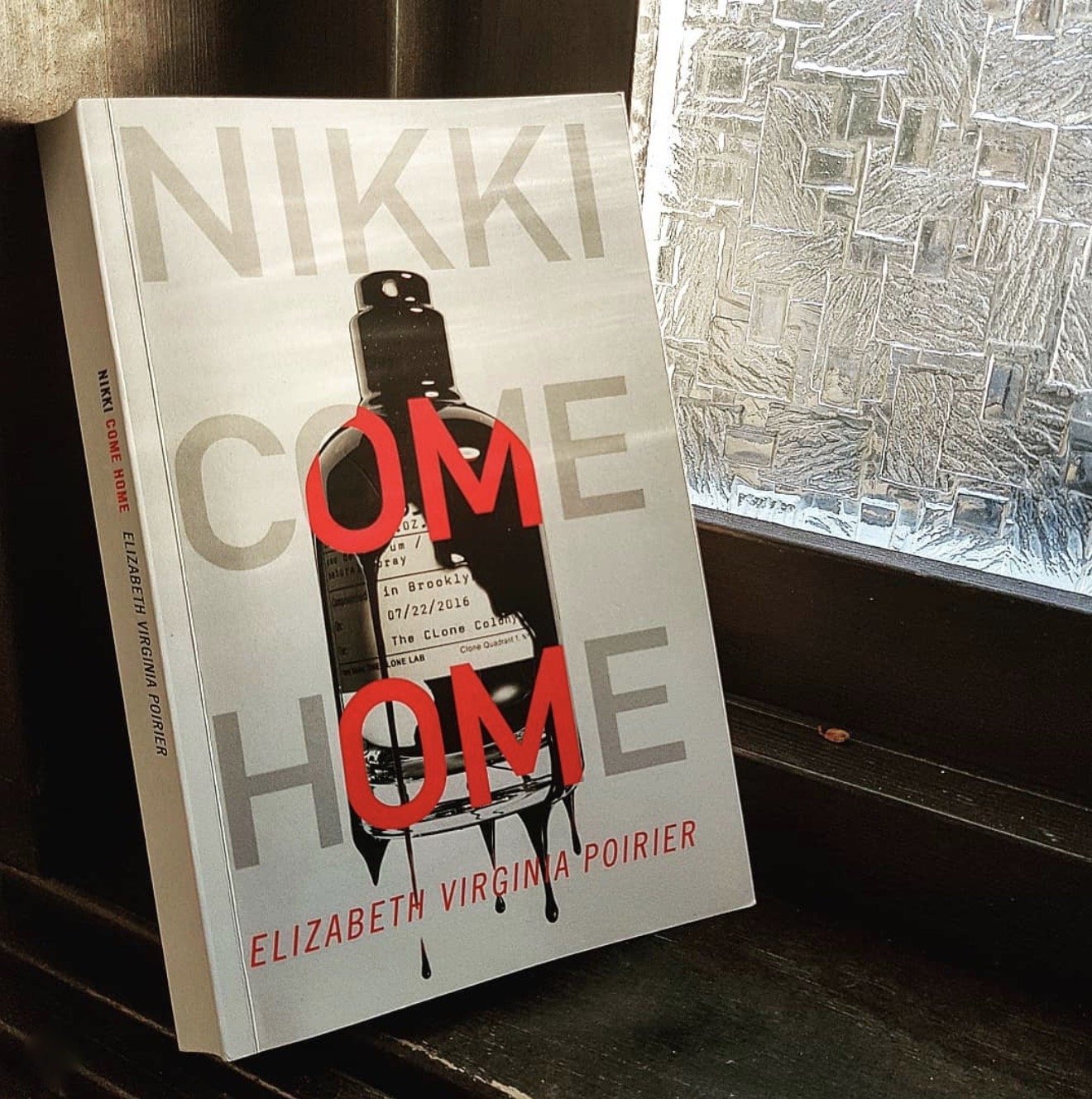
Cover Image
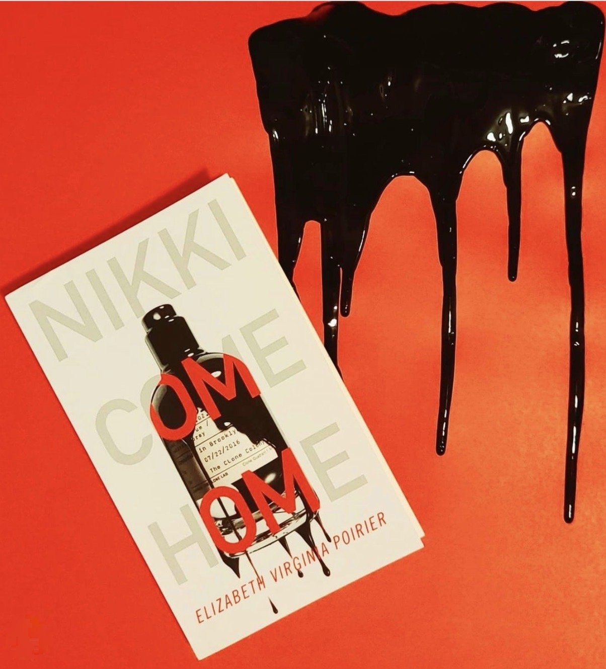
Le Labo’s Santal 33 Bottle. This smokey wood-scented perfume is mentioned an obscene number of times throughout the book. Our Le Labo version, the details listed on the label—time, place, something called the Clone Colony—sneak the reader into the world of the novel before the book’s been cracked. The final touch—another layer of storytelling—the drips of “warm dark stuff,” an unidentifiable substance you aren’t sure if you want to sink your teeth into or make a call to the EPA.
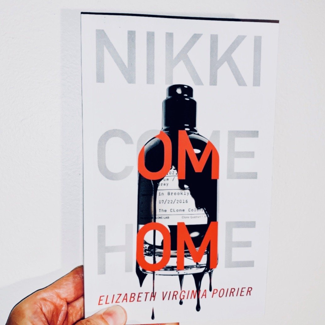
Final Cover Design
We wanted the final Nikki Come Home cover design to be stark with an eye-catching image. The title letters outlining the bottle in red—a color that commonly symbolizes love, anger, and what we see when our subway train’s 20 minutes late—portend where the reader will be headed. Aqualamb’s Swafford designed the back matter that includes a fantastic blurb from Gilmet Media’s senior producer Kimmie Regler of ‘The Cut on Tuesdays’ podcast.
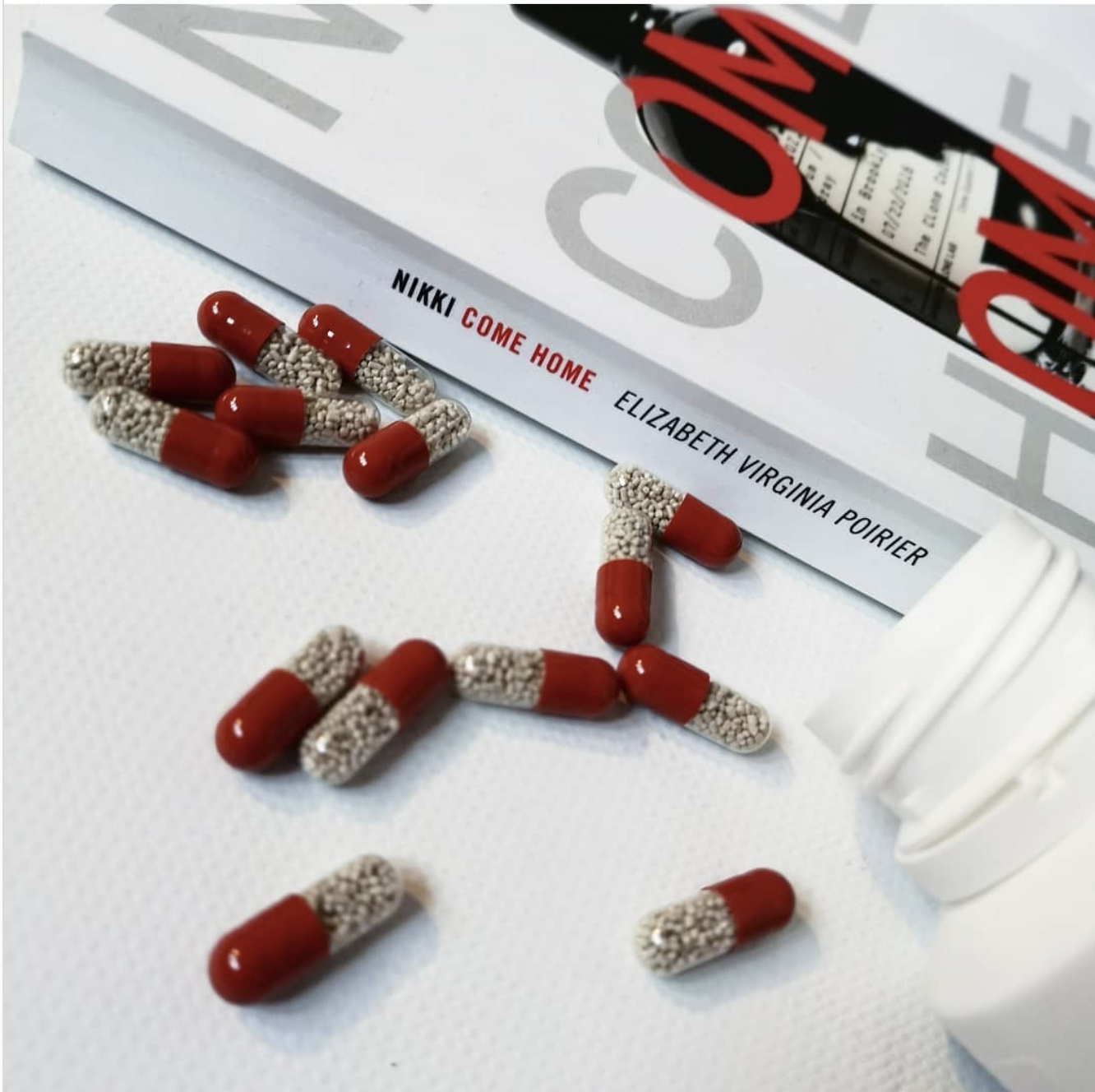
The Promotion

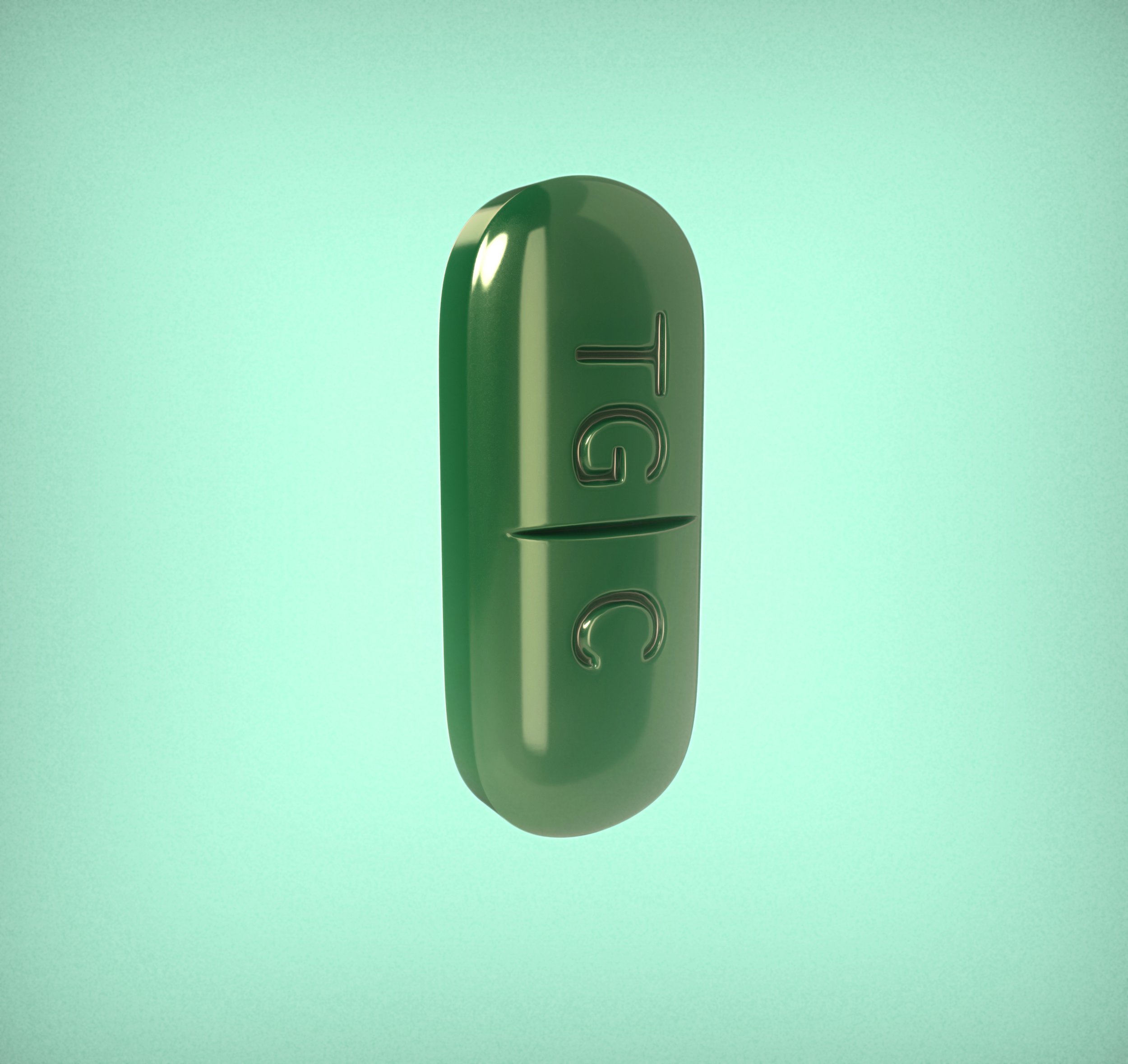
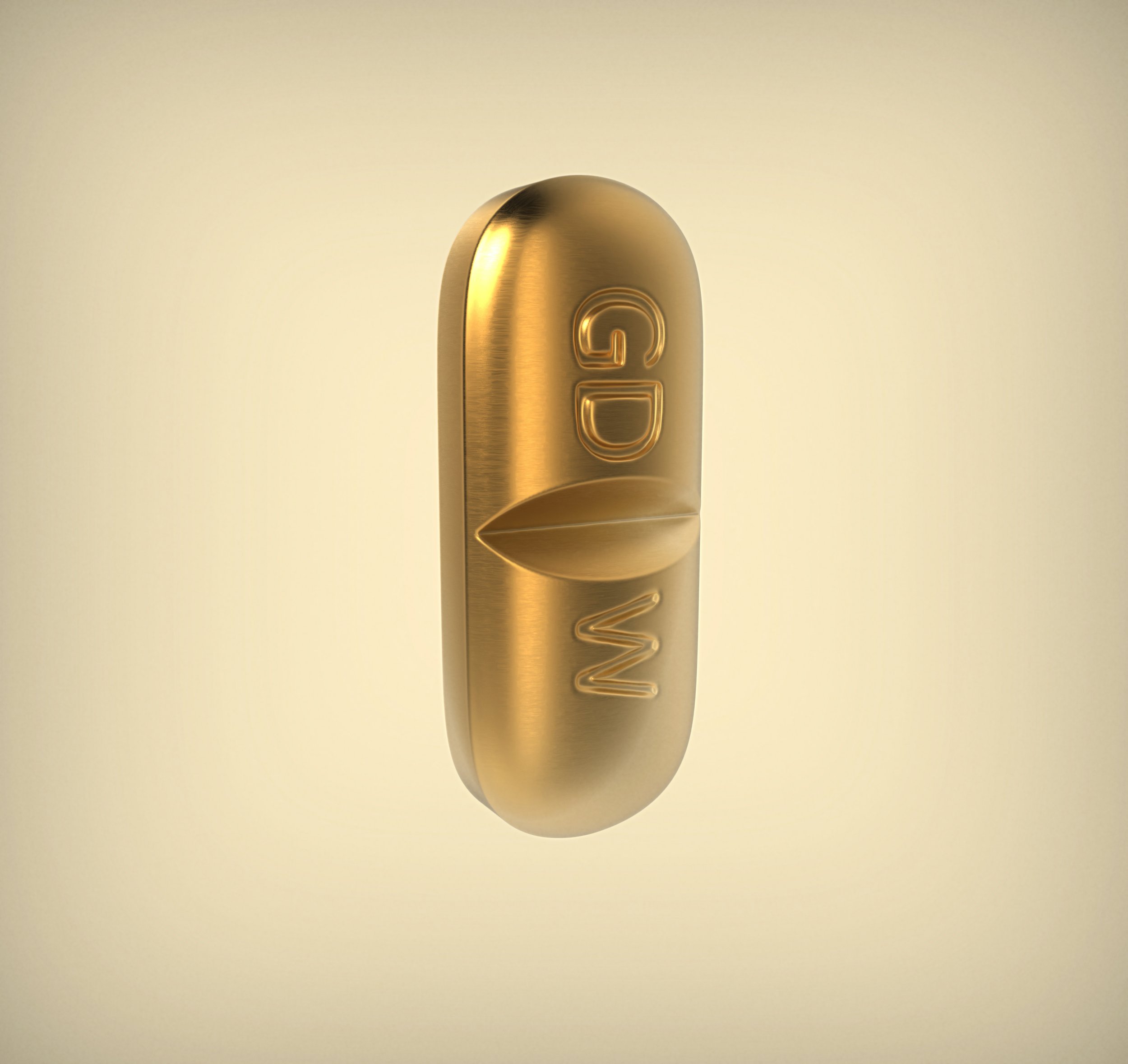
Our main character Nikki Dickinson’s on a pill regime as part of her mental health recovery. The goal was to give these pills some life, pump up their cachet with a little bling-out of personality that’s already present in the book.
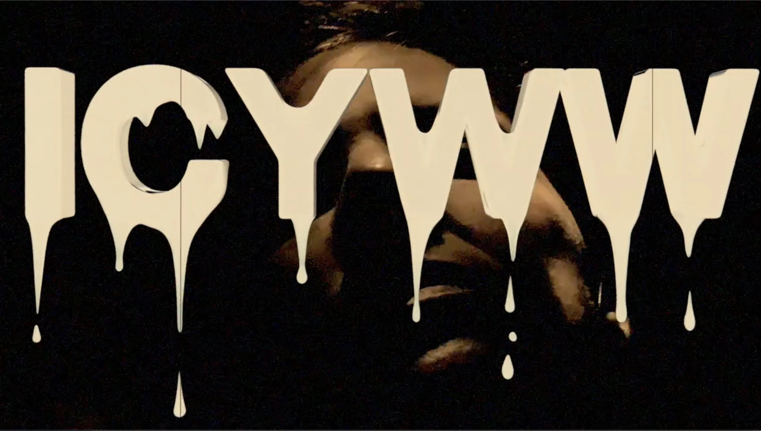
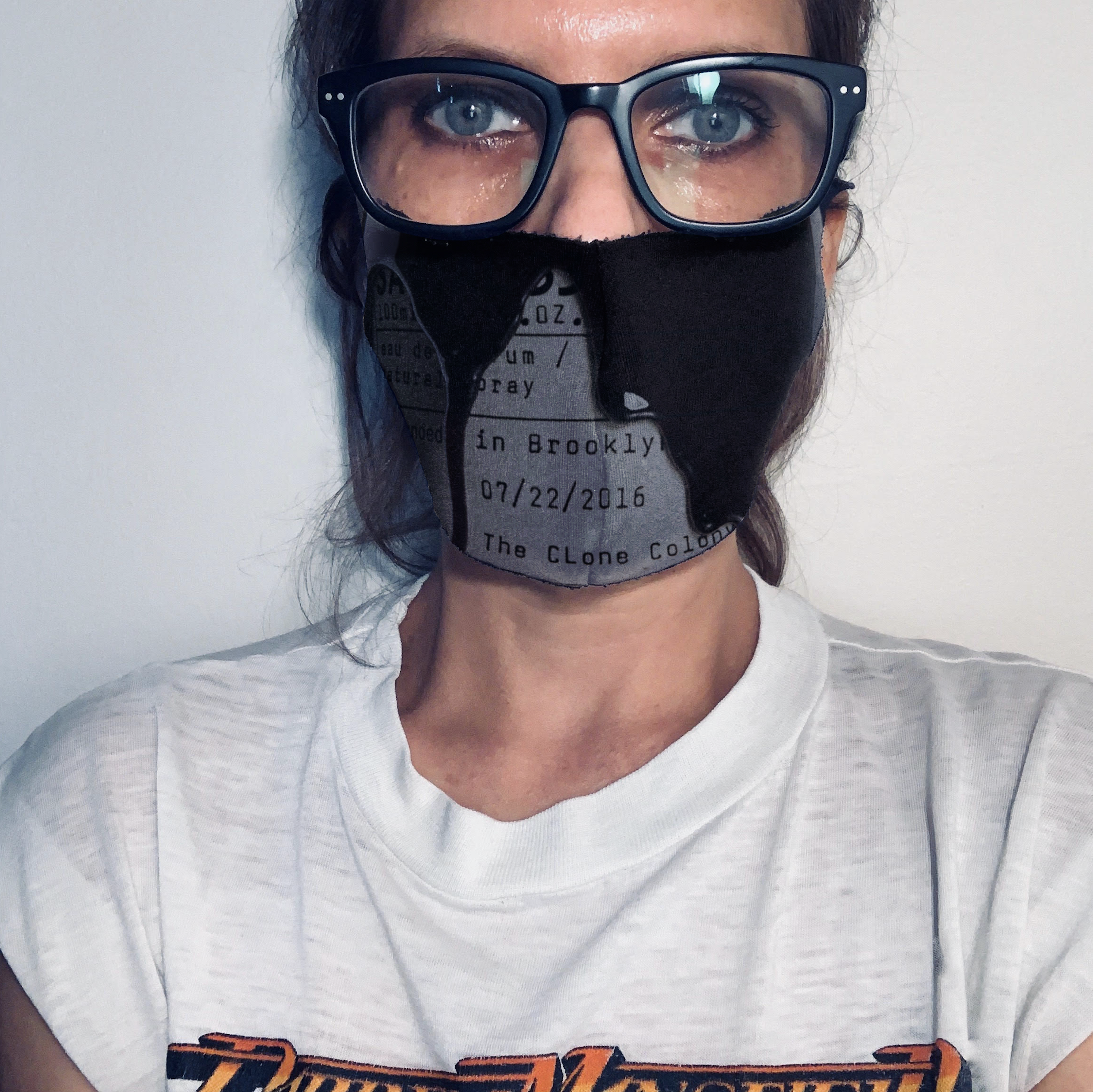
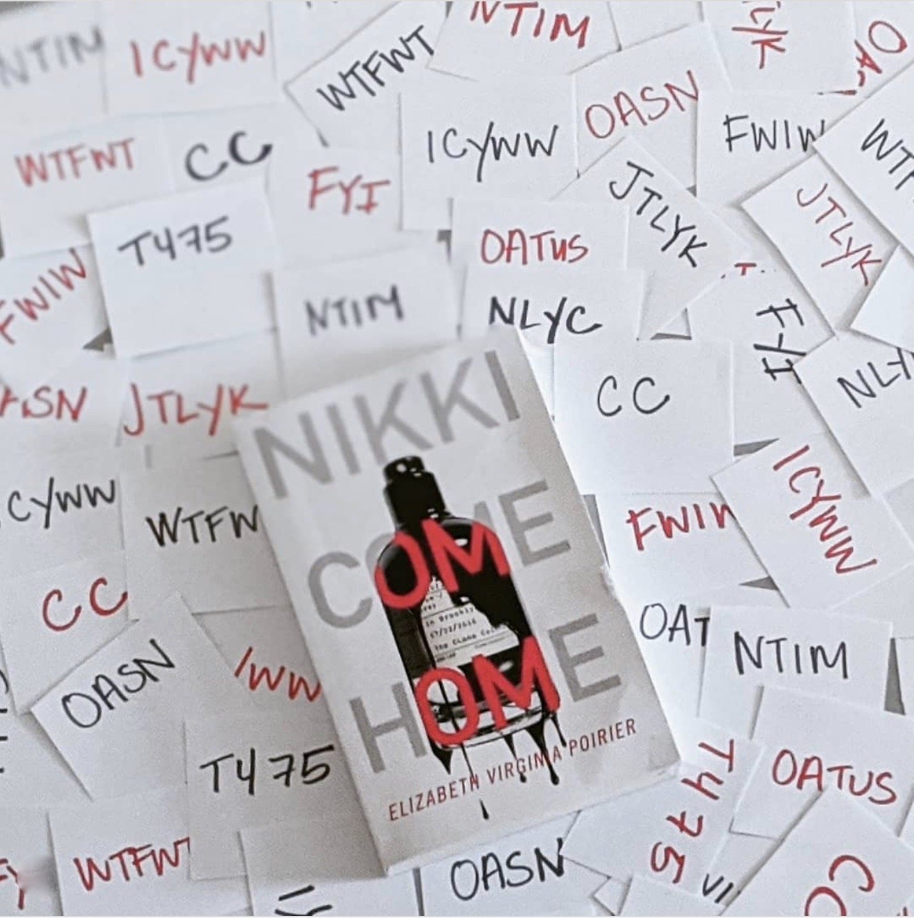
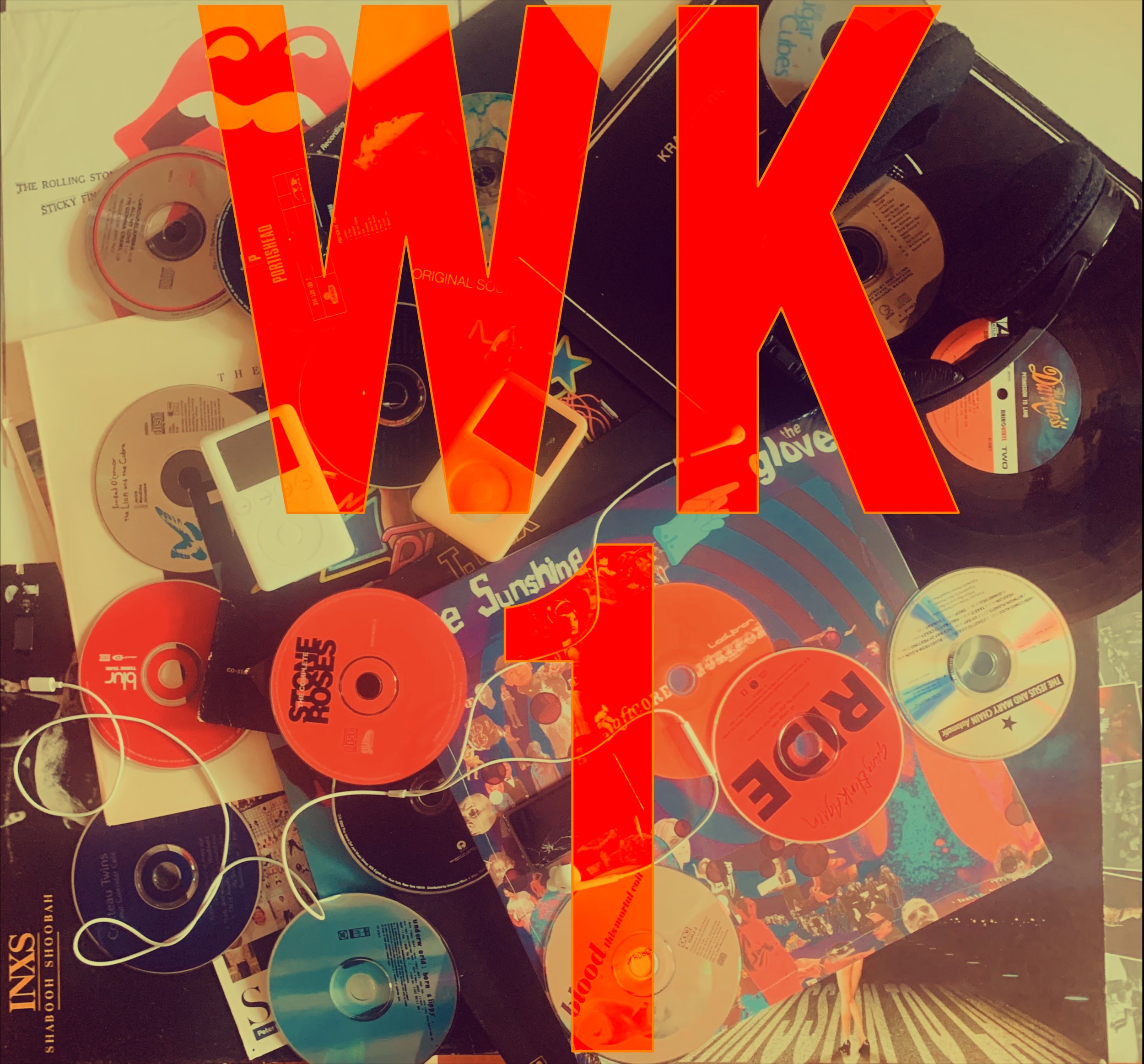
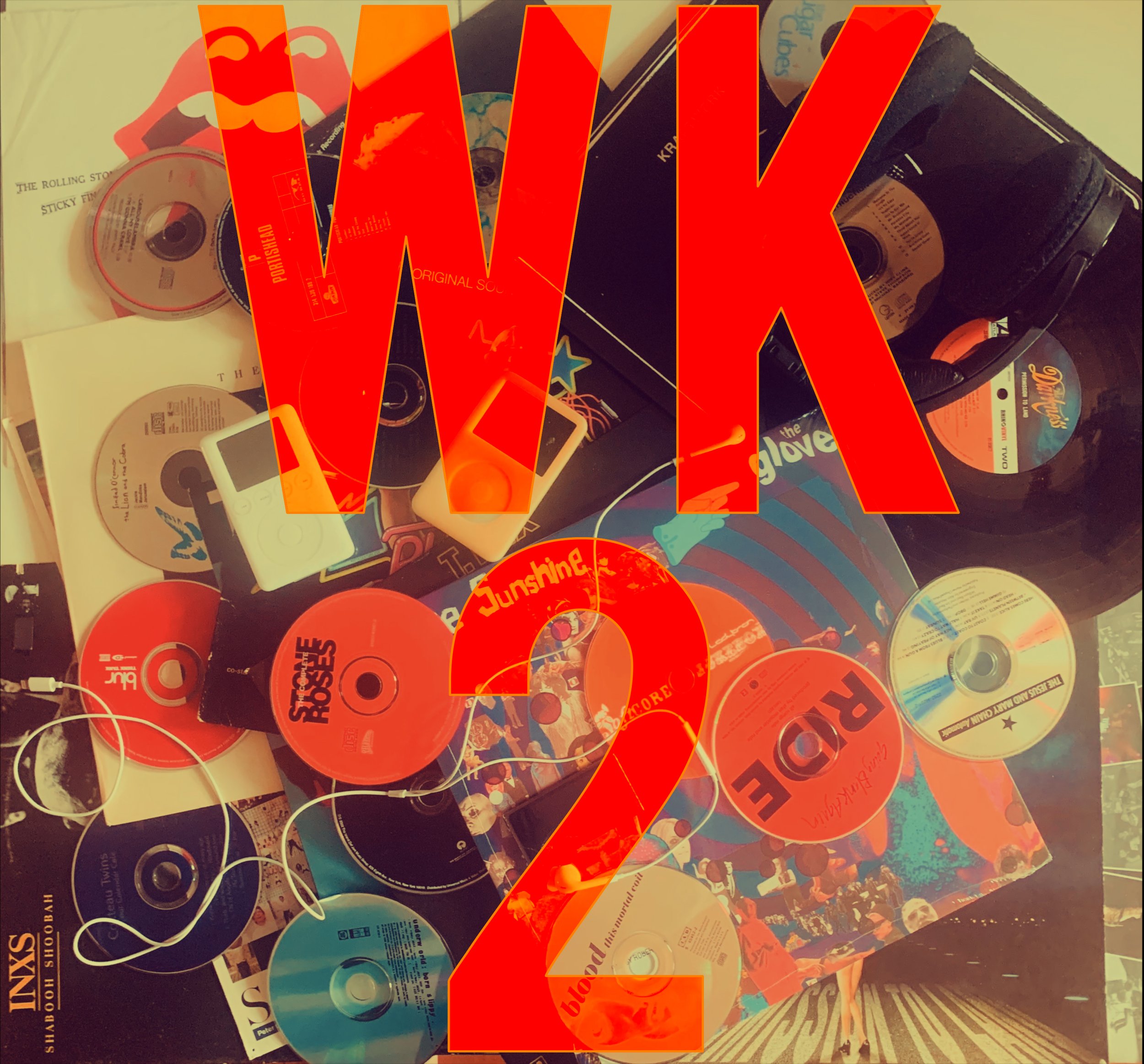
chapter titles


Nikki Come Home’s nine chapters begin with common text message abbreviations. In our initial book promotion push we gave the first two chapter titles—In Case You Were Wondering and For Your Information—the Le Labo bottle “Warm Dark Stuff” treatment. Like with the bottle the letters drip with dark ooze, an ominous foreshadowing of what’s in store for the reader.
Promo Videos
The novel was Published in Paperback in 2020. It was mostly promoted through Instagram for obvious pandemic reasons. Reaching out to the incredible and tight-knit Bookstagram community helped rev up reader reviews and push book sales.
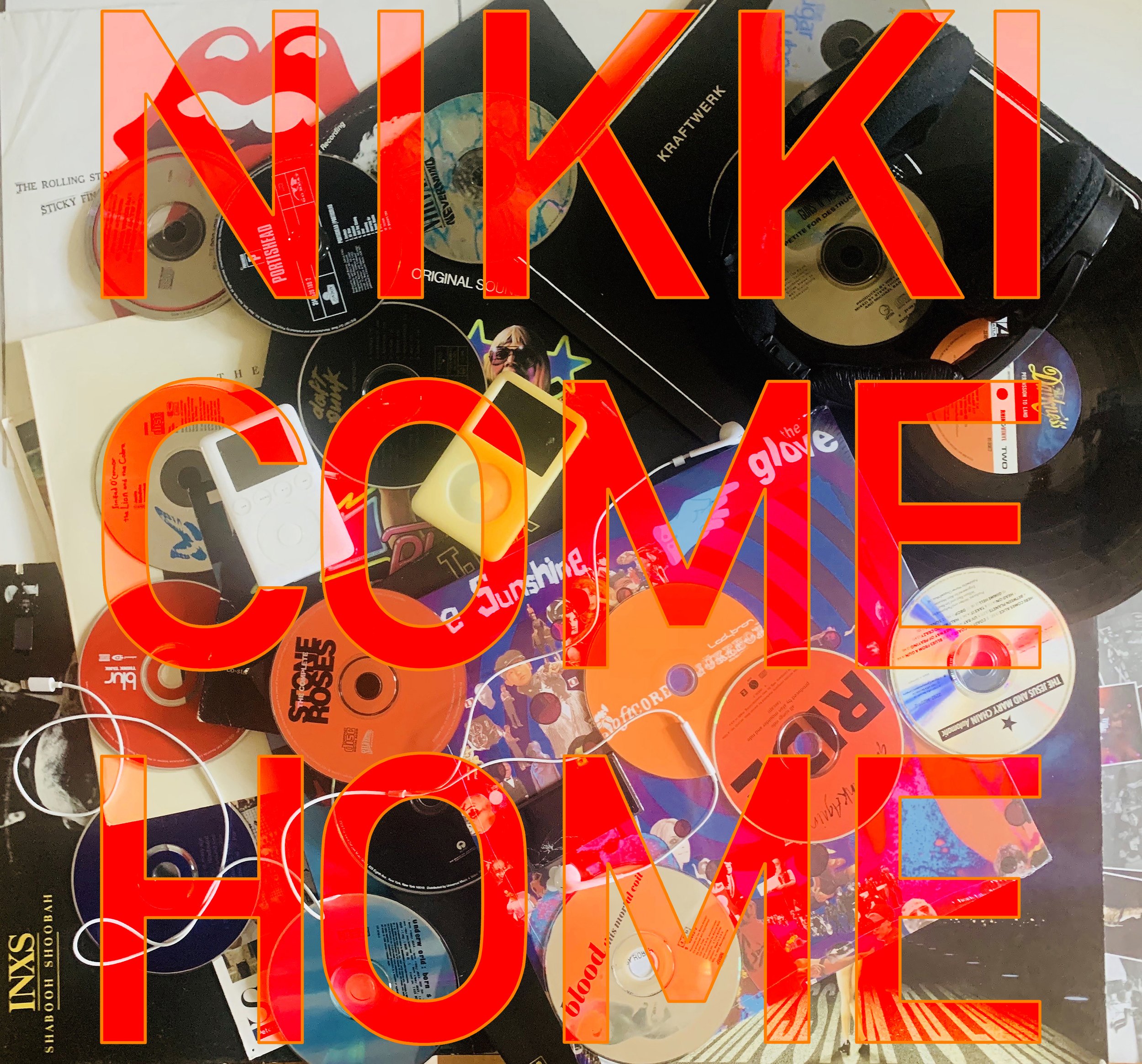
Spotify Playlists

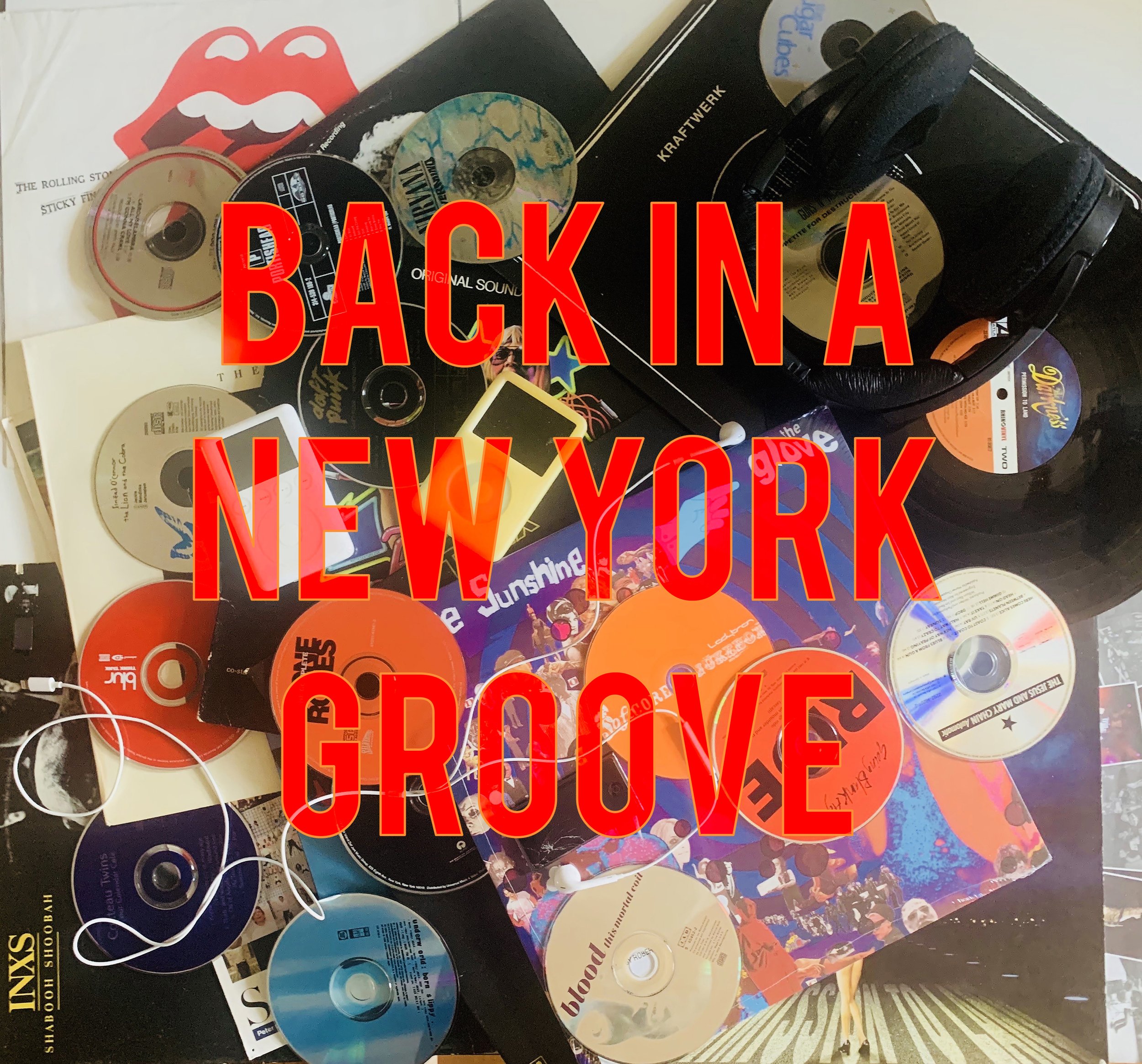
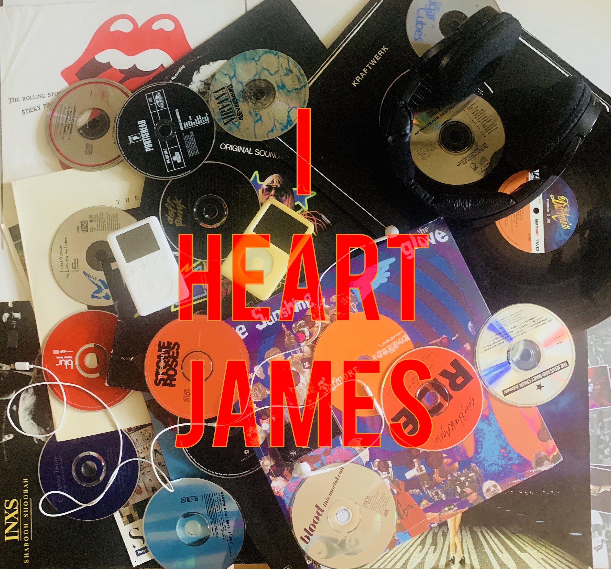
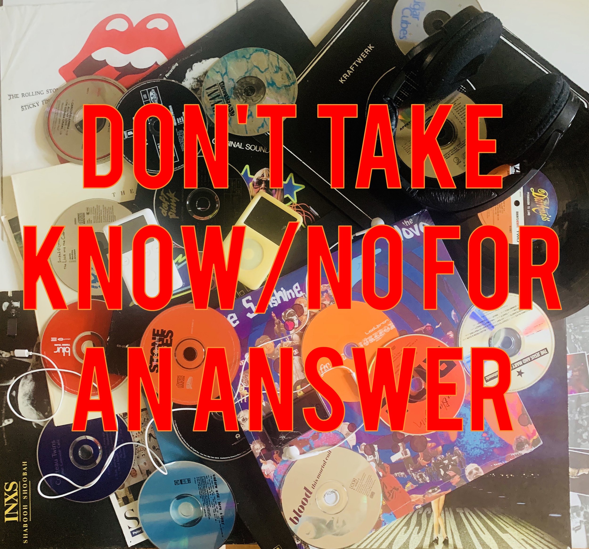
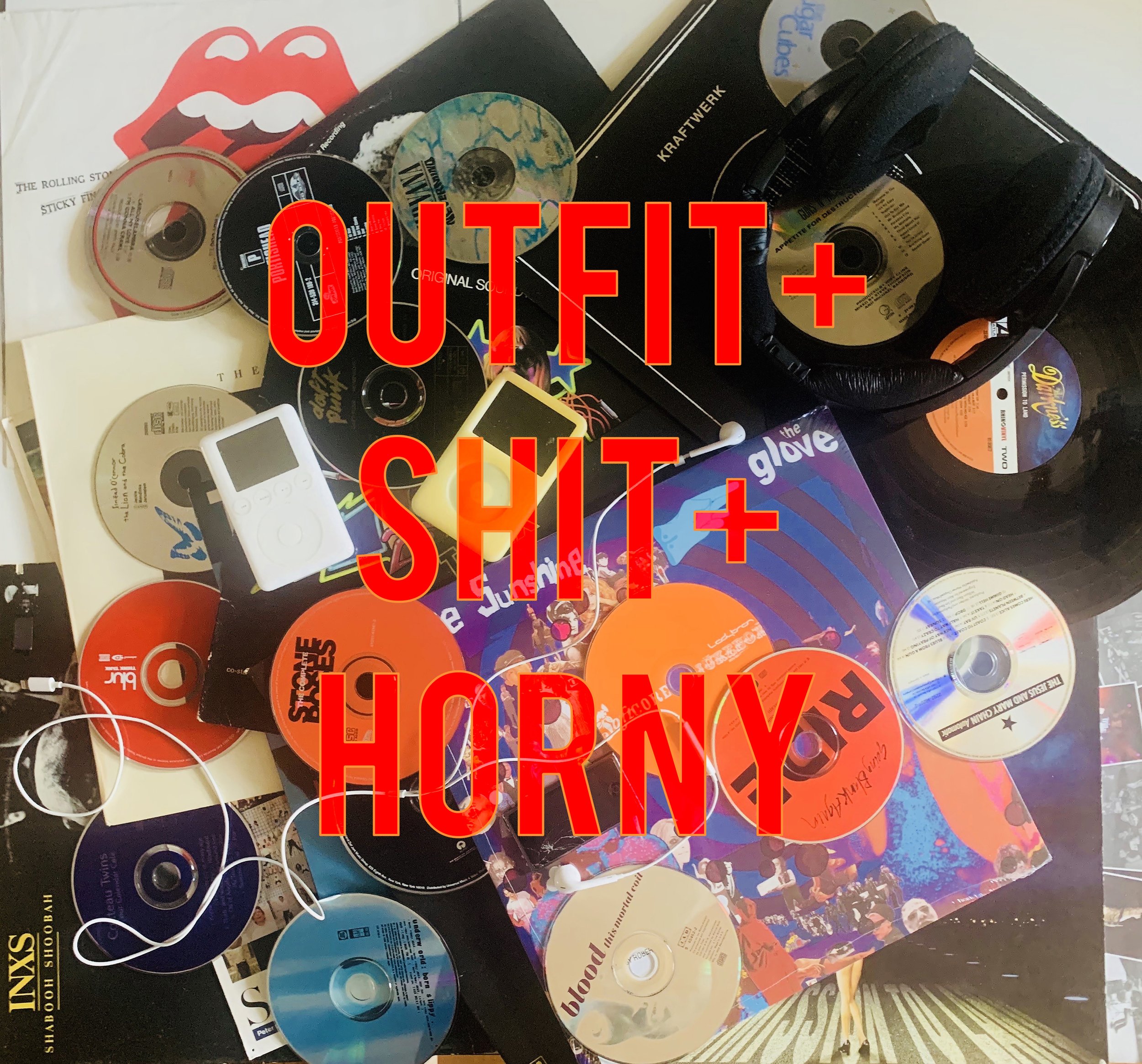
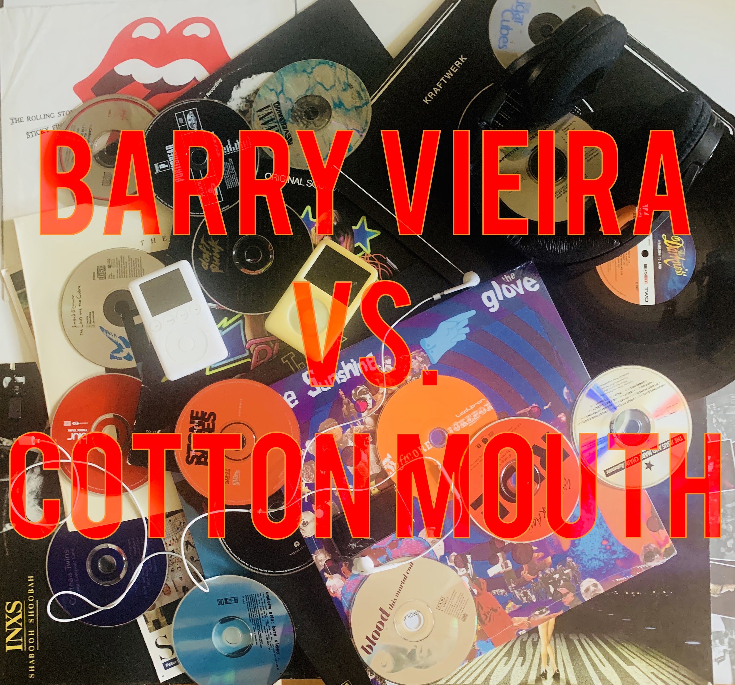
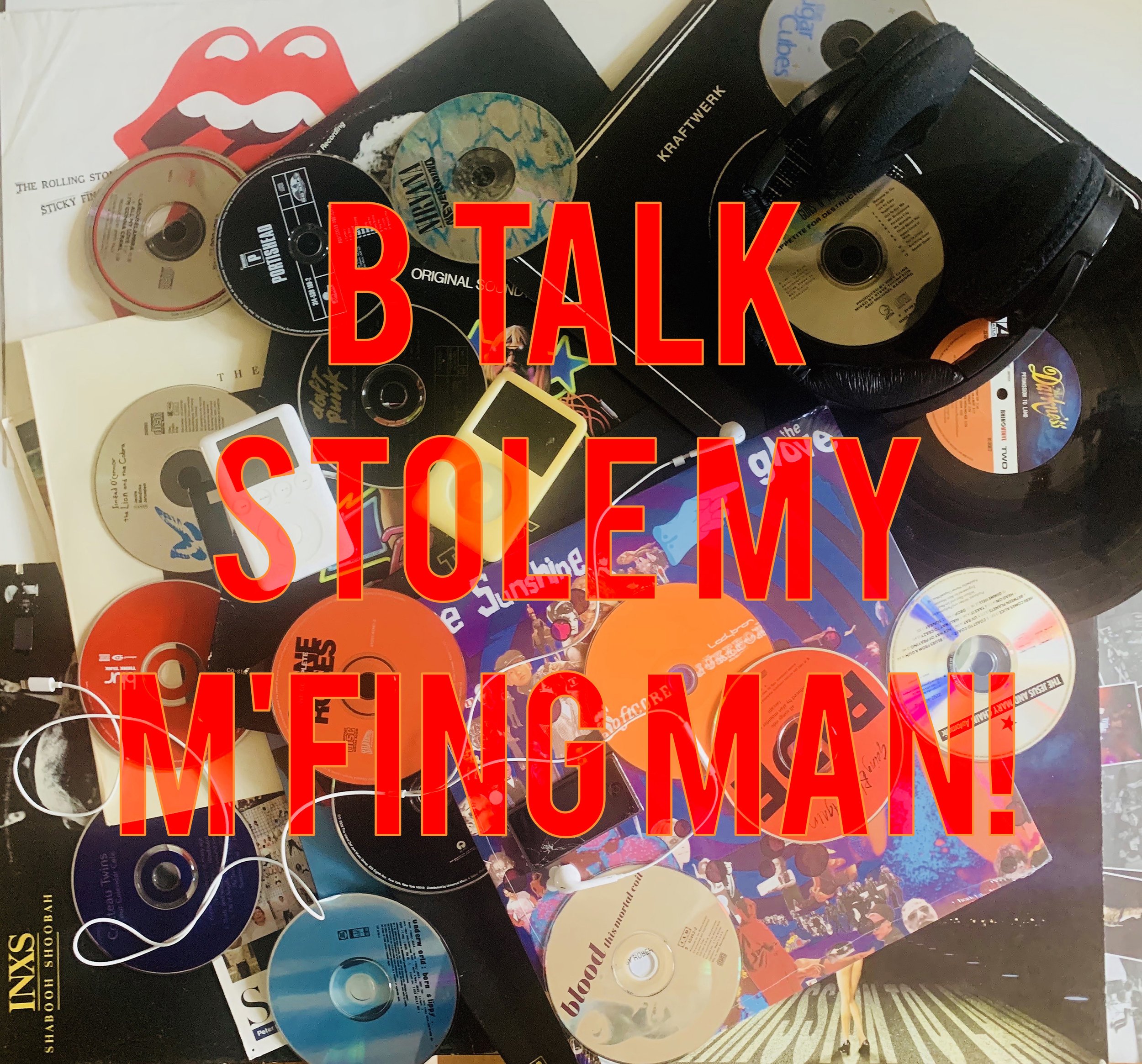
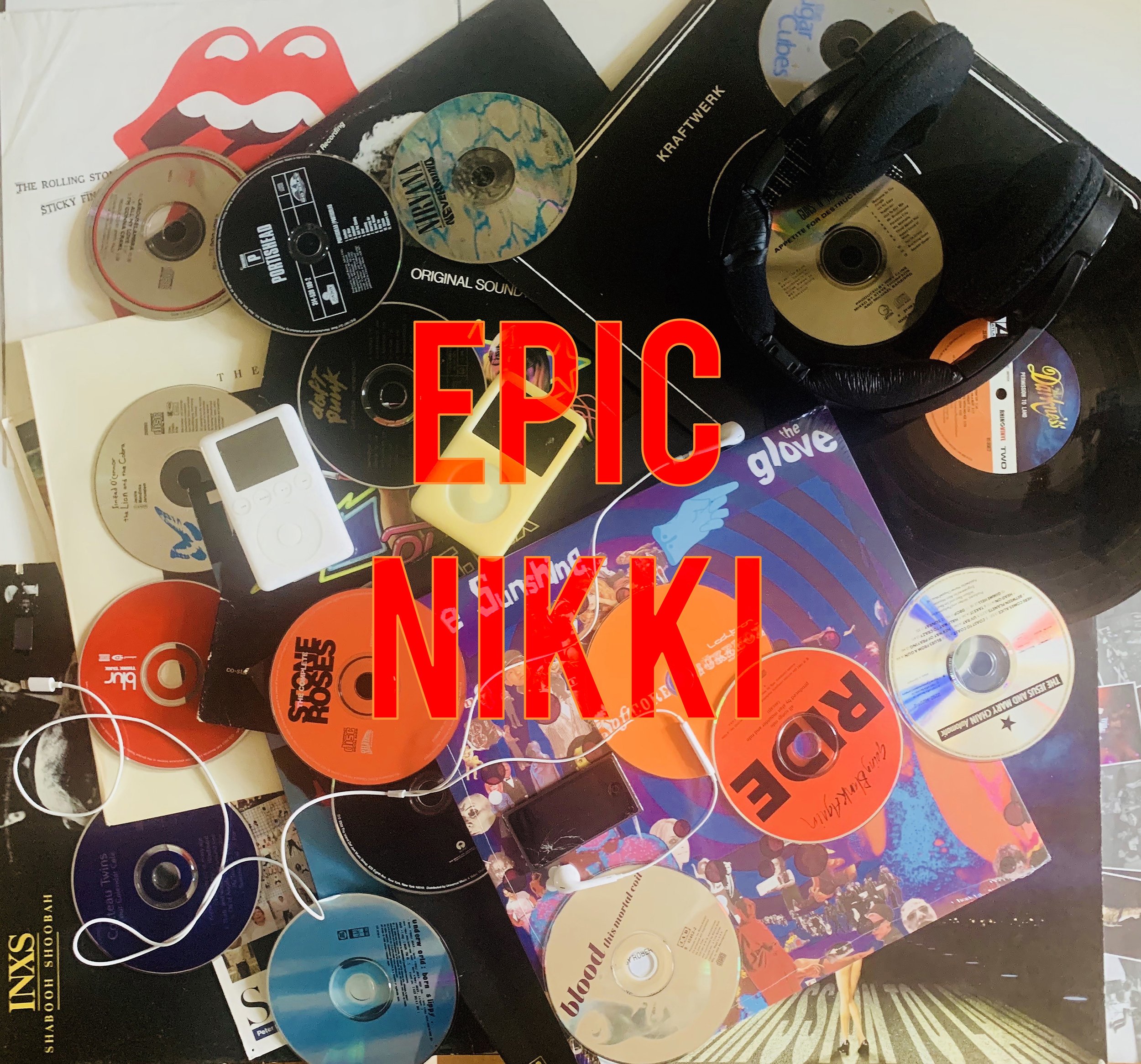
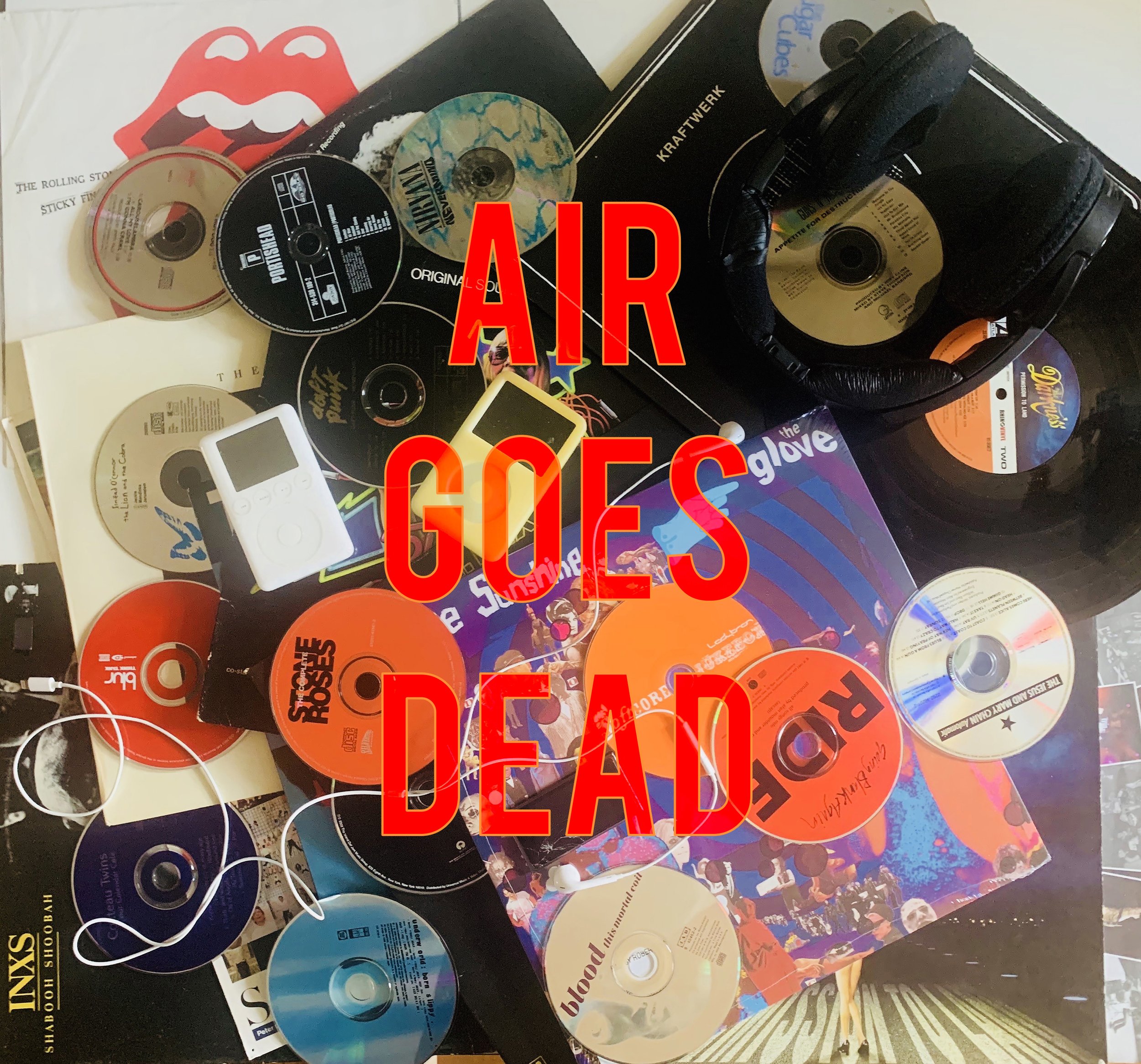
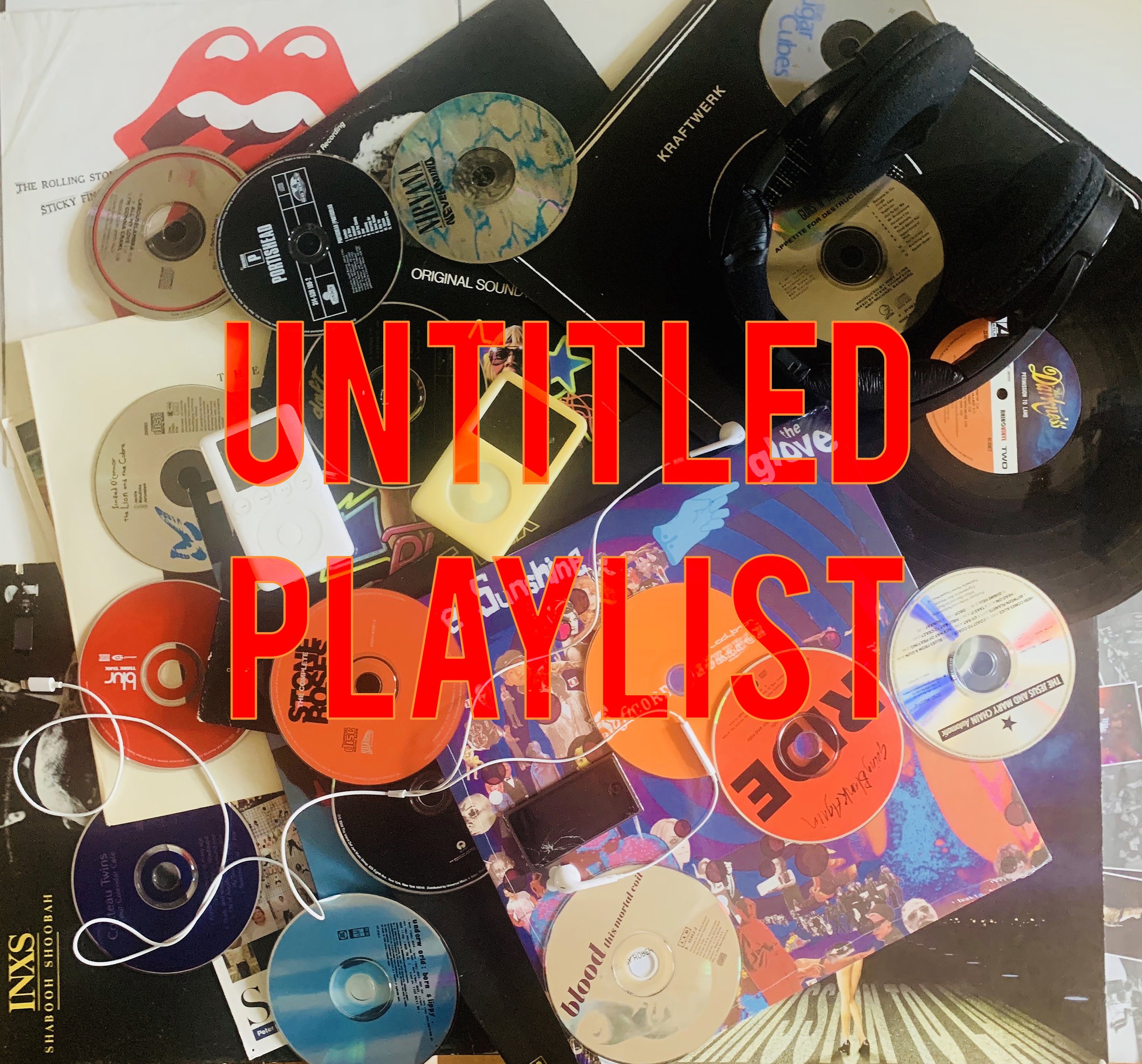
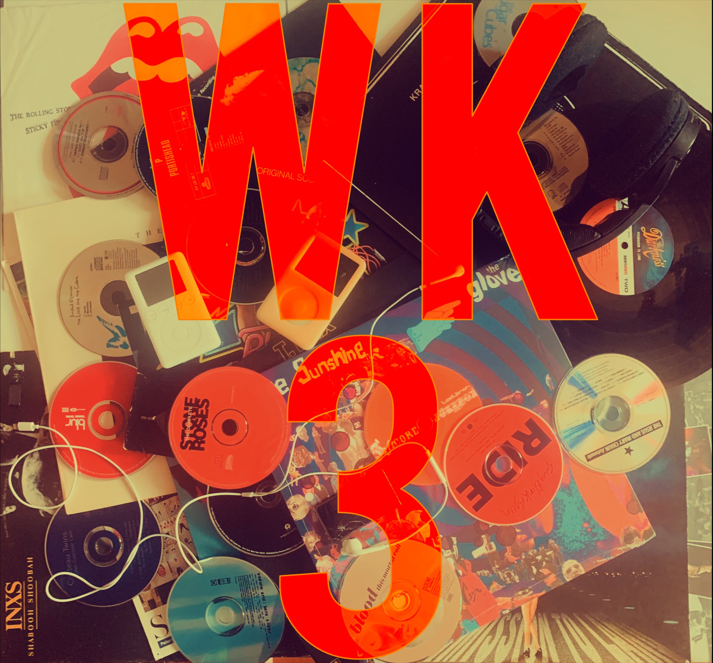
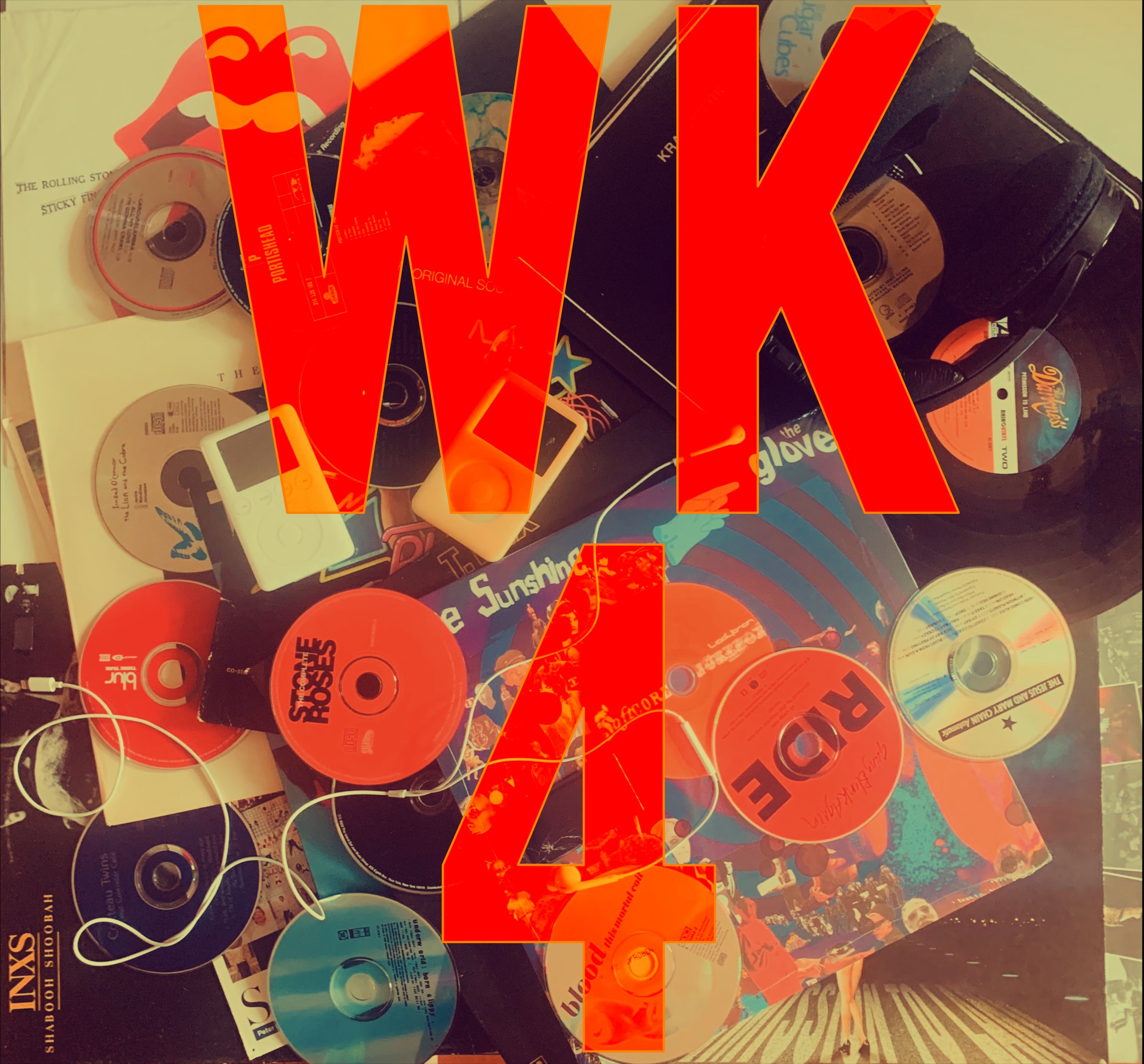
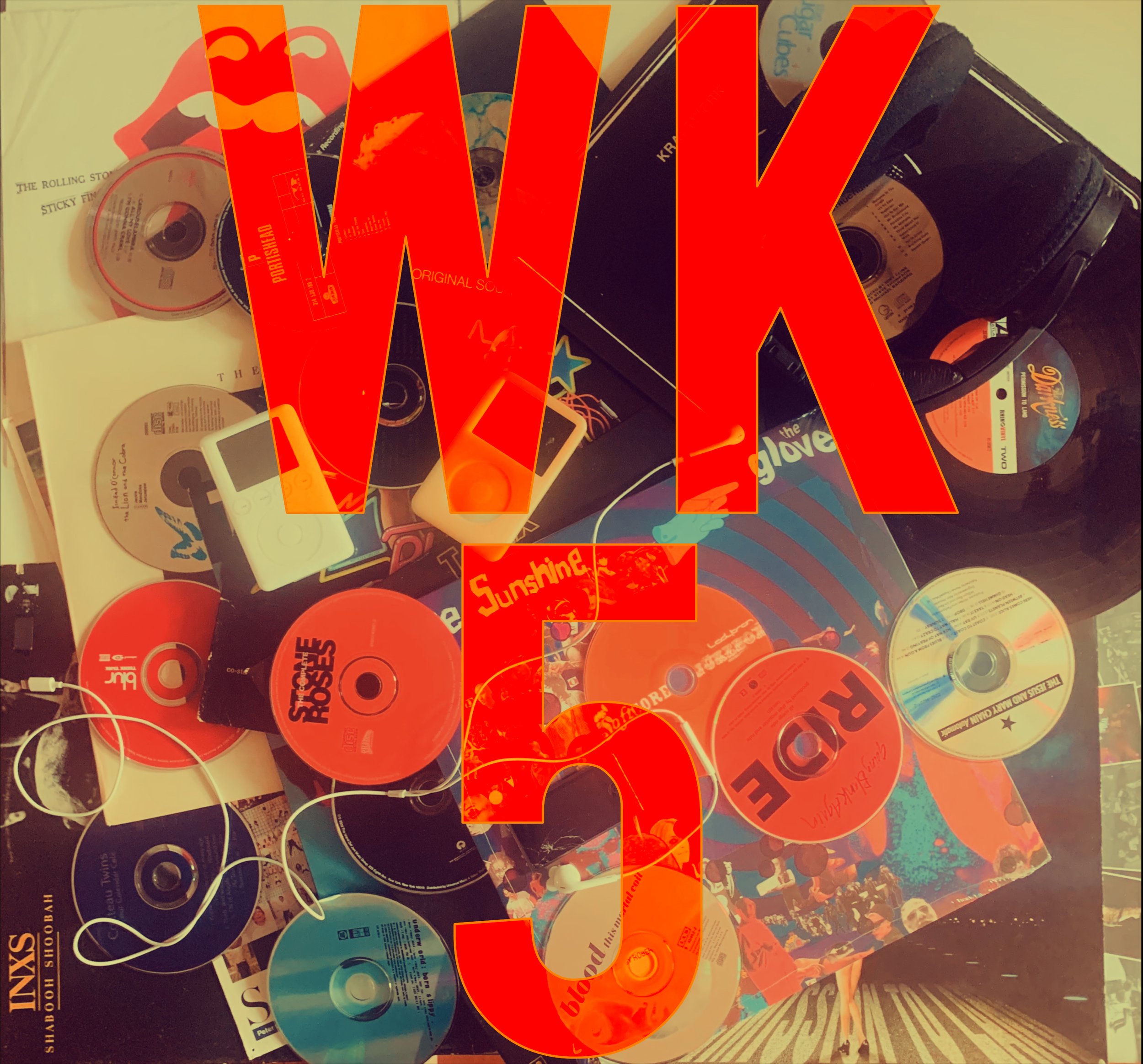
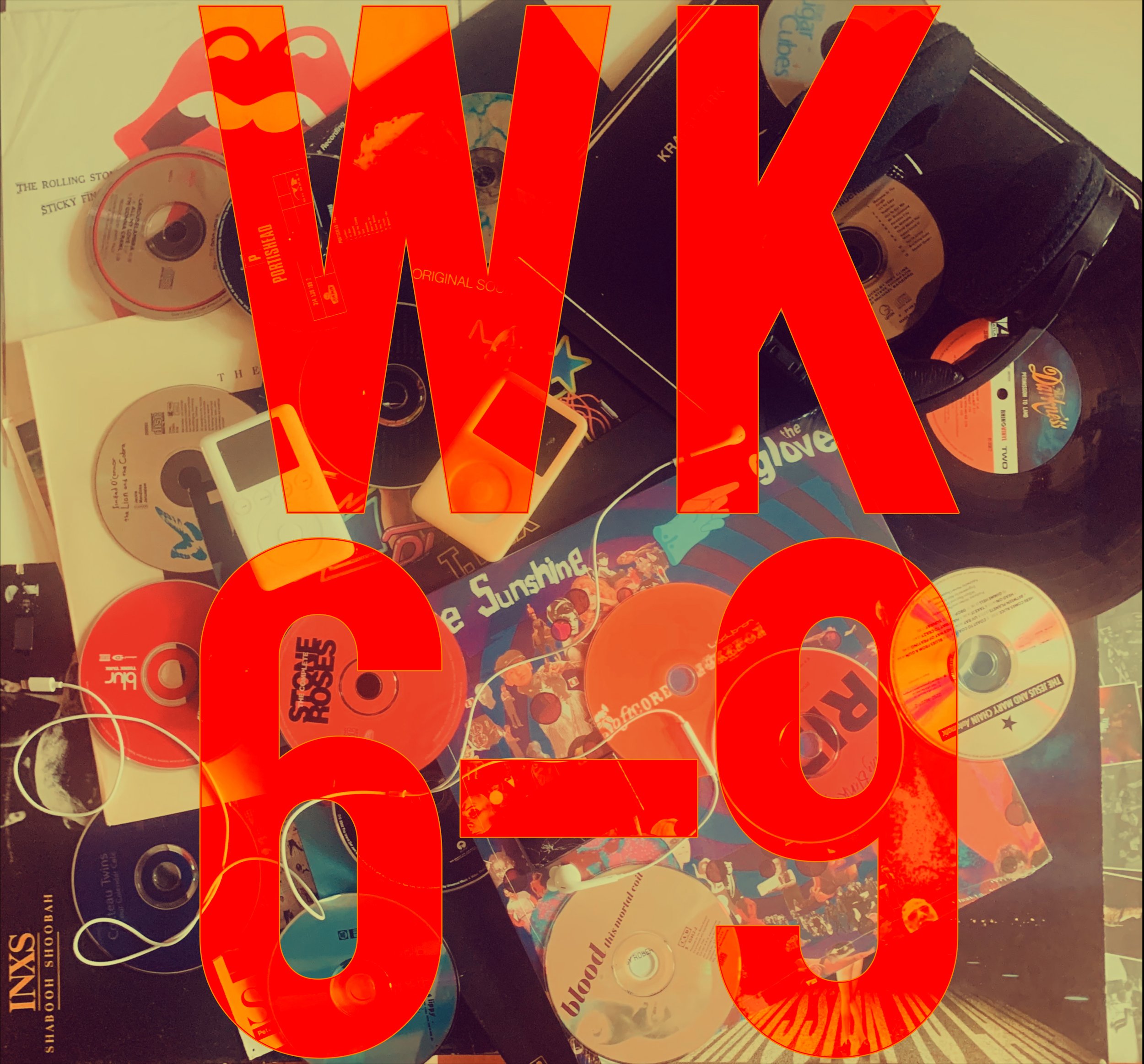
Playlists Show up throughout the novel. The titles of these playlists and the songs included in them are a way in which the main character expresses herself. Connecting the music in the book to an outside streaming service, like Spotify in this case, interconnects the novel with the real world. The playlist art is a collaboration between Brent and myself. We carried the red over from the cover and gave it that “candy” look from the cover’s Le Labo bottle.
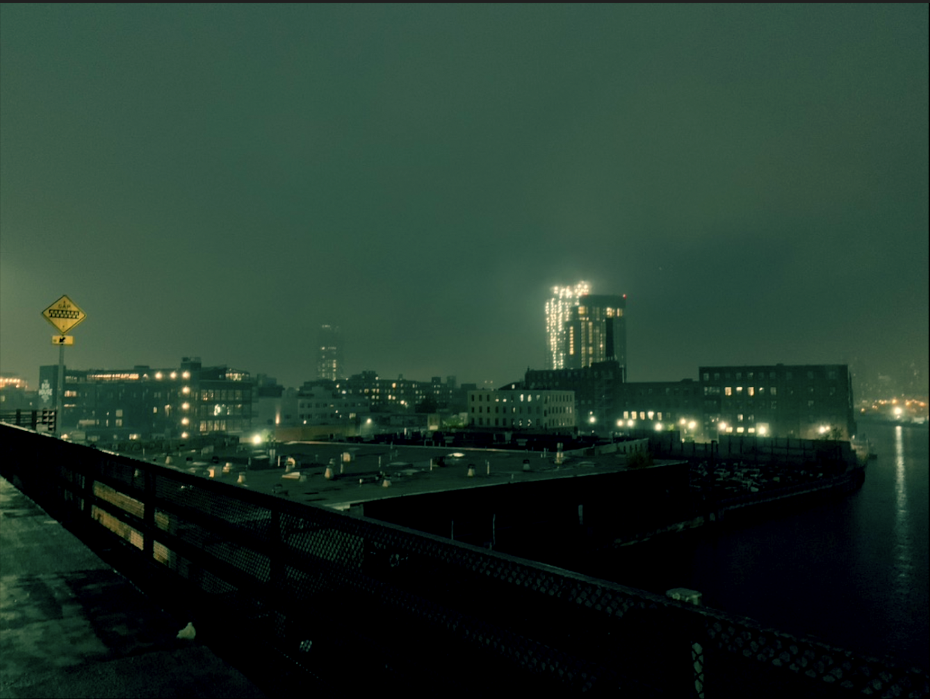
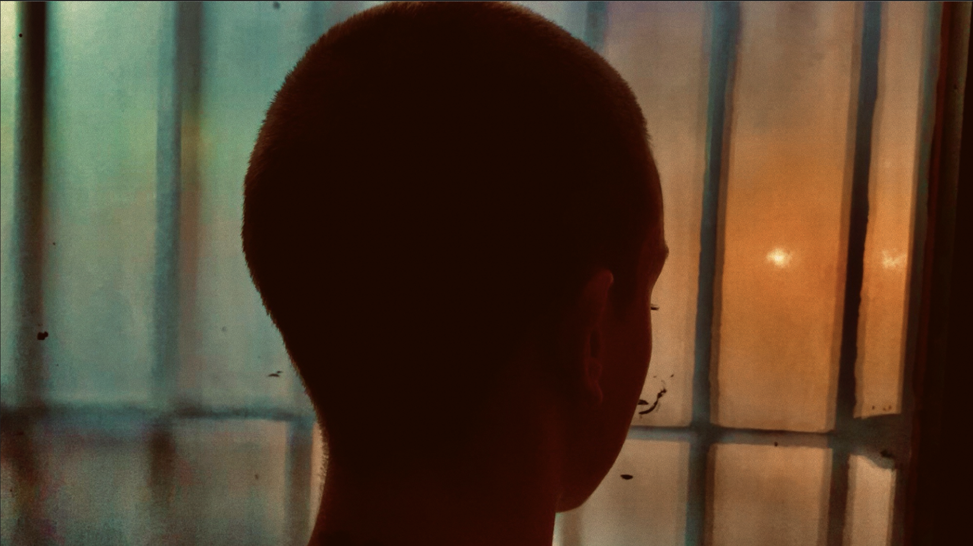
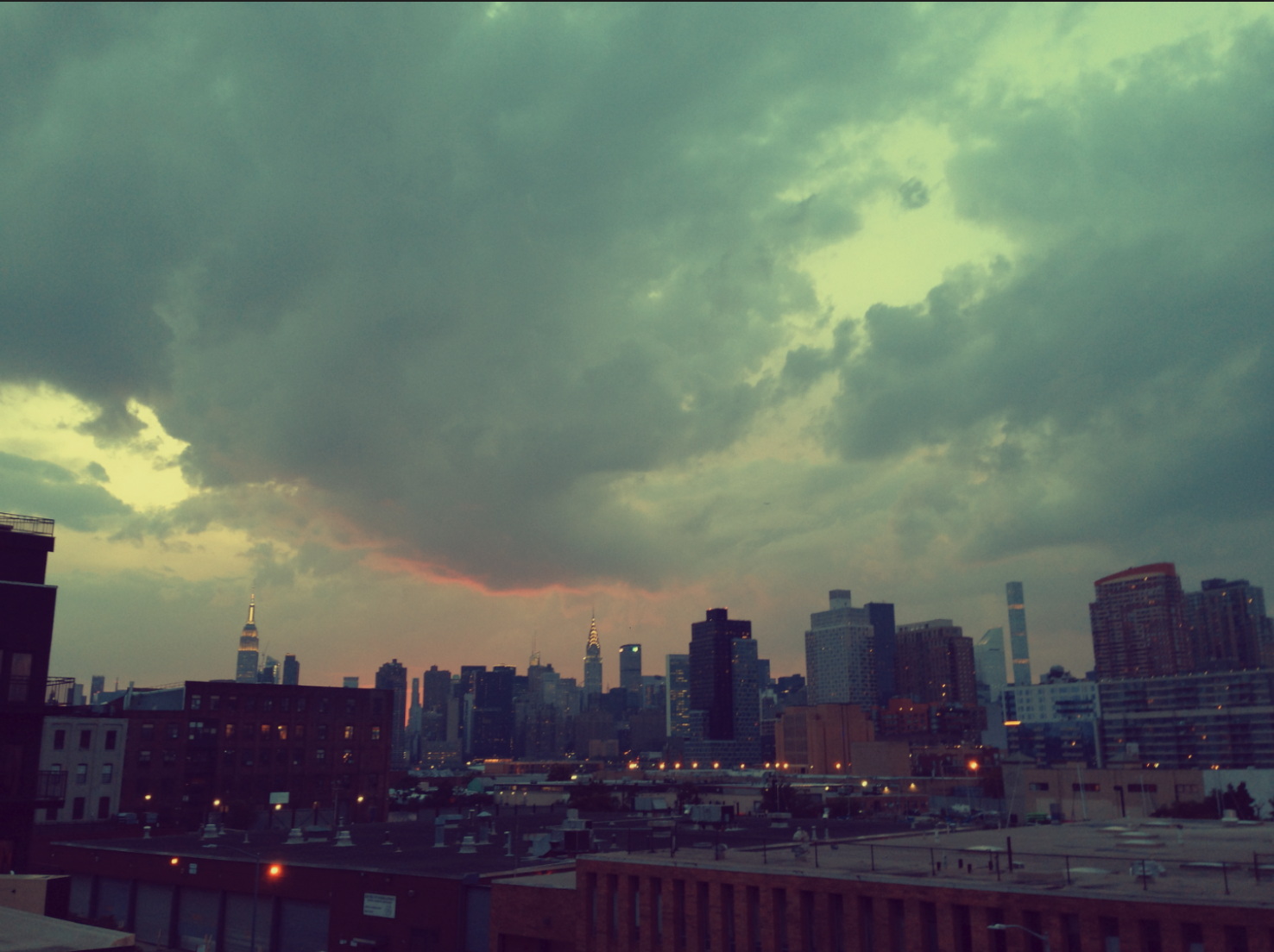
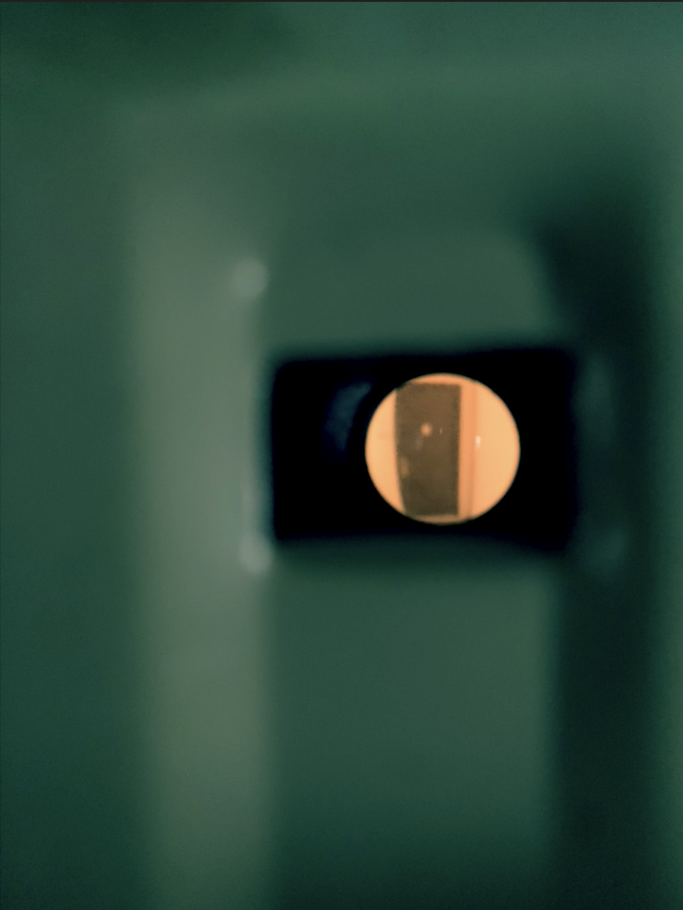
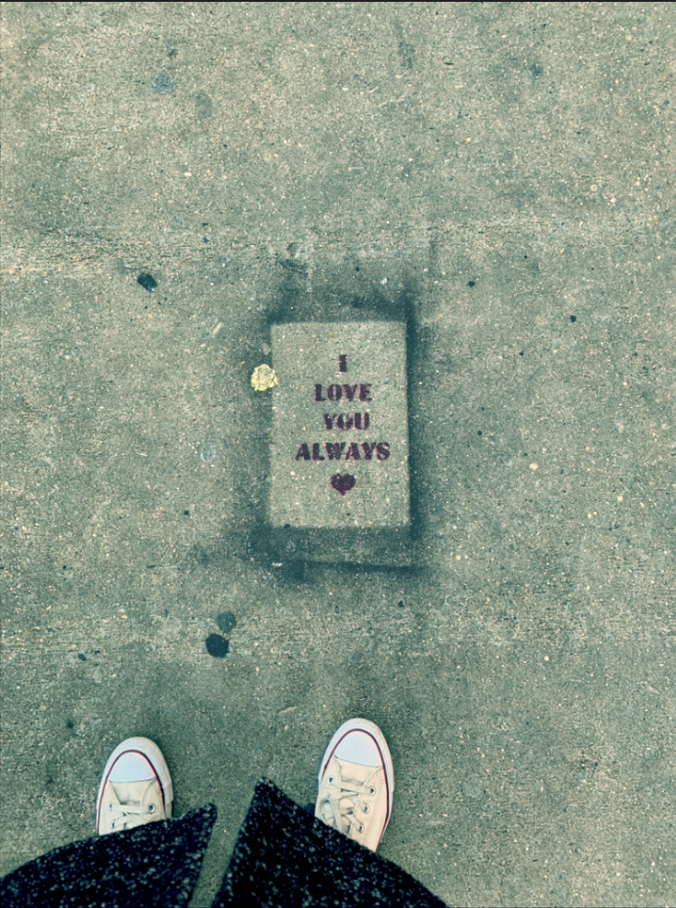
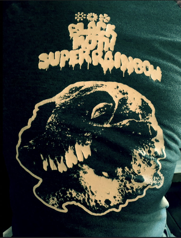
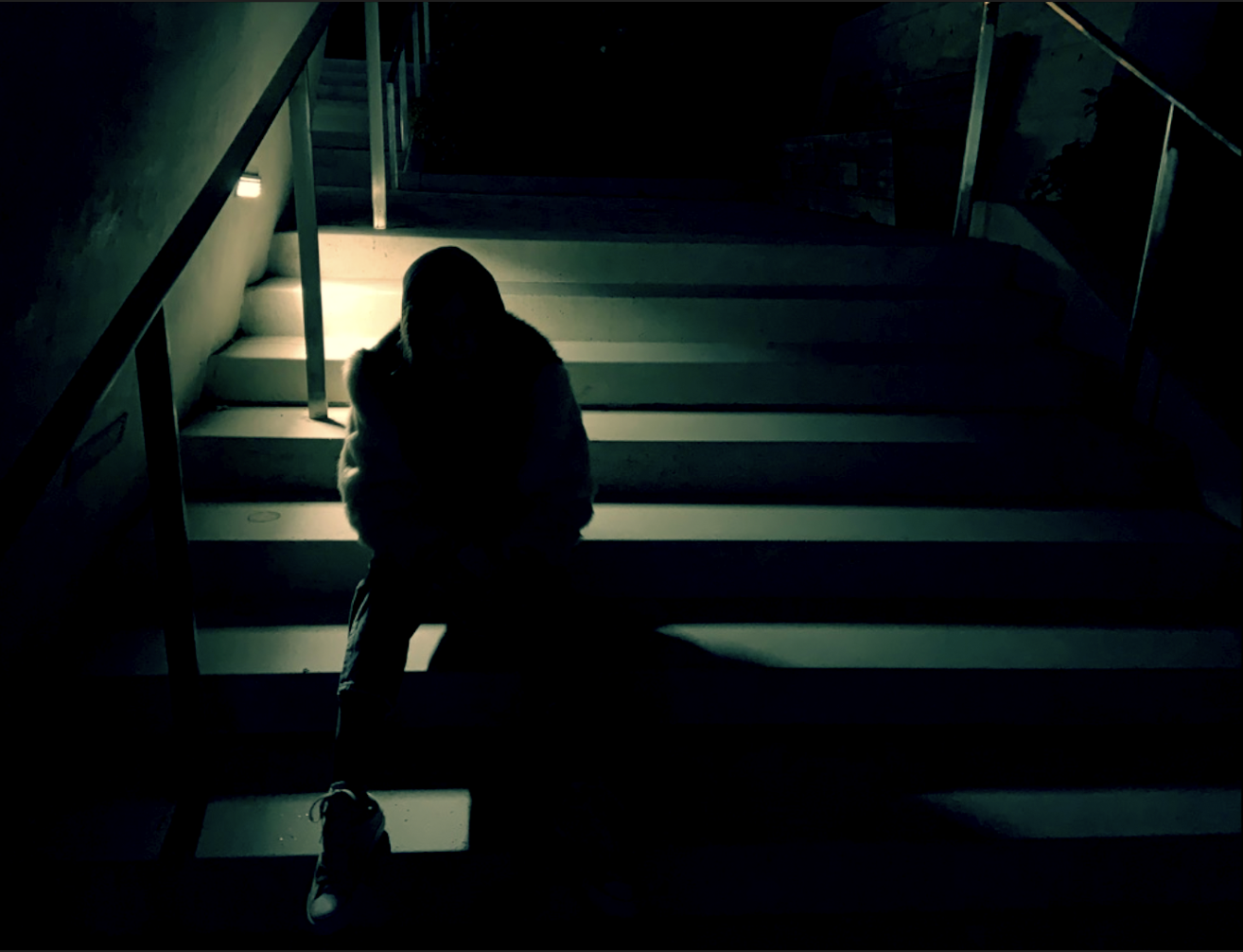
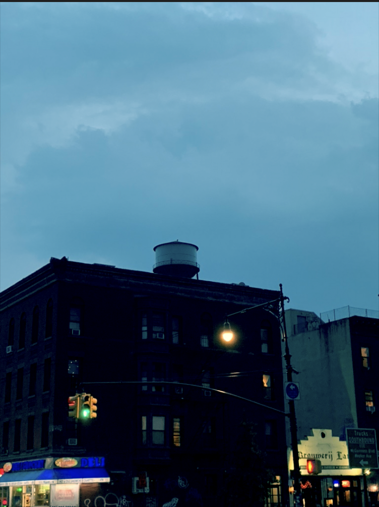
The Visual Vibe